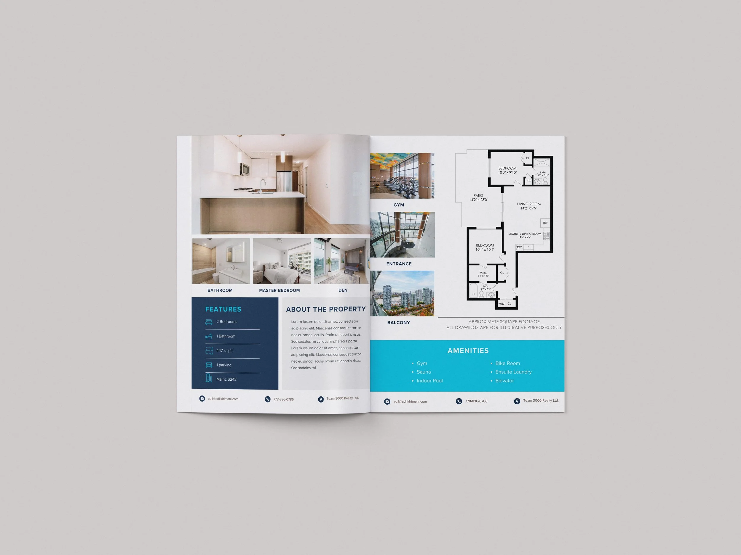
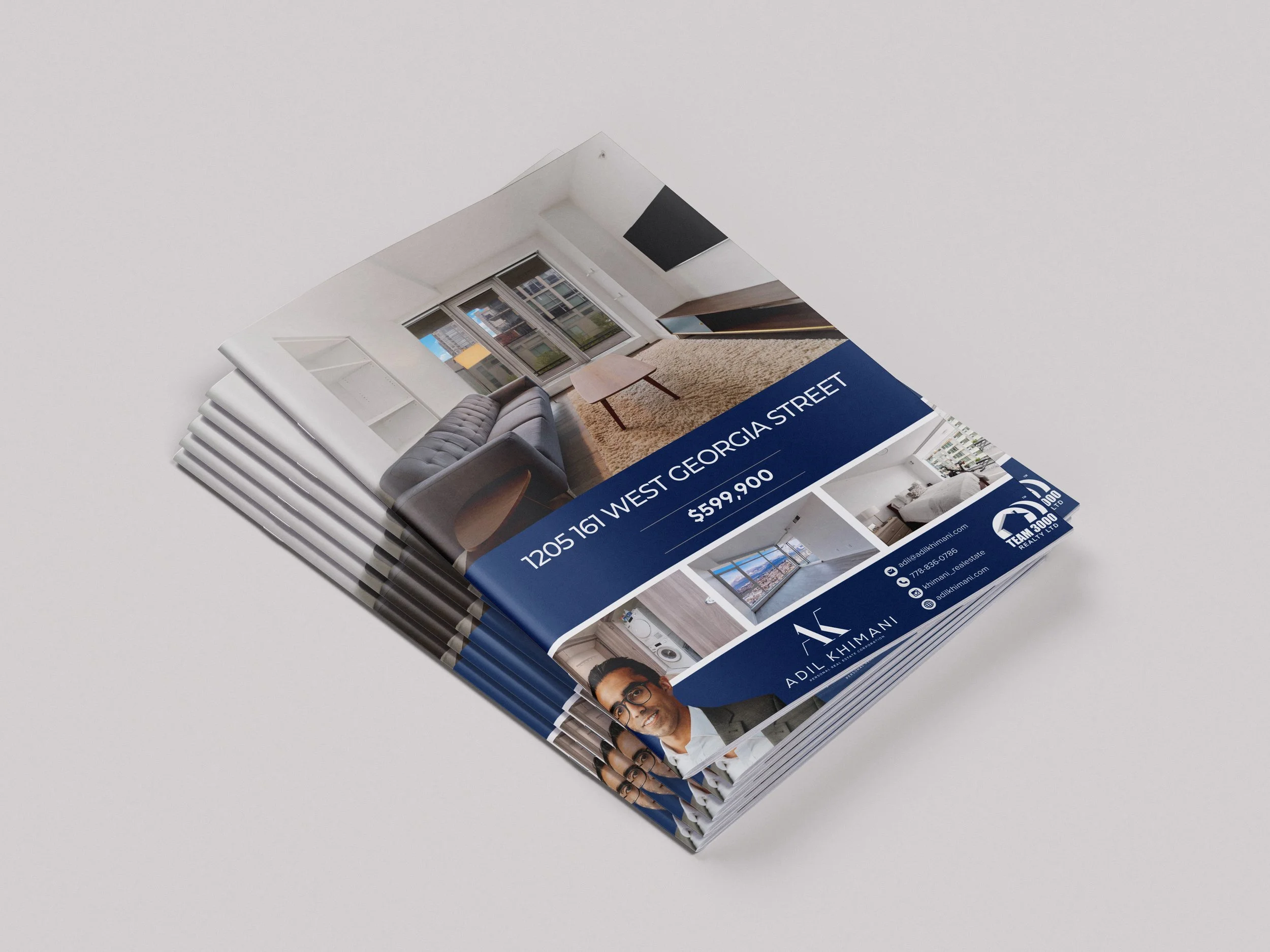
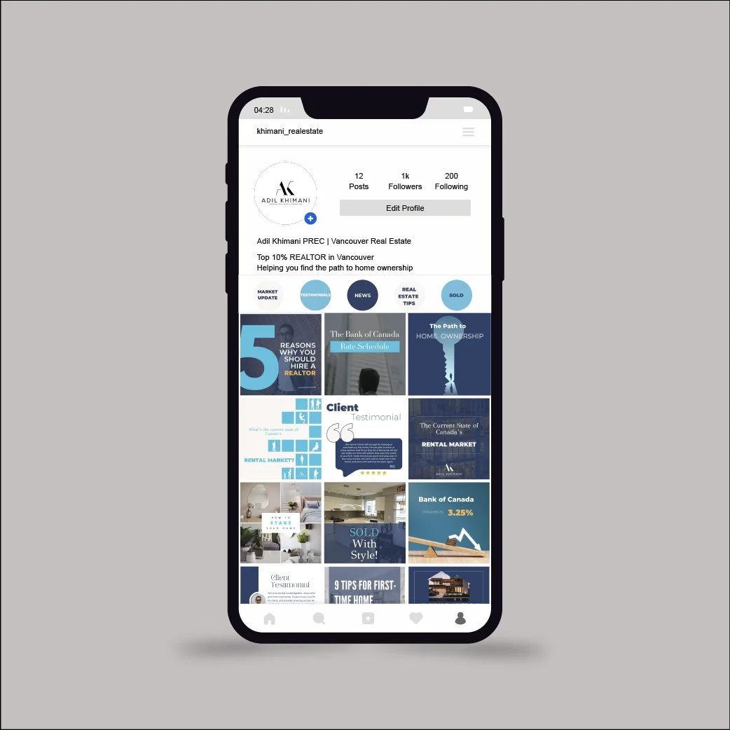
Adil Khimani PREC*
A top 10% medallion real estate agent in Vancouver who needed some fine-tuning his brand and social media presence in order to grow his team and streamline his social media efforts and save time on his marketing content.

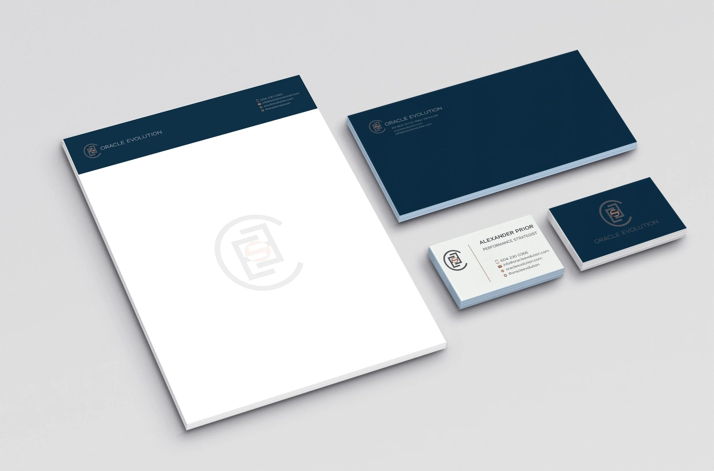
Oracle Evolution
A performance coach based out of Vancouver specializing in leadership performance and employee development. Their approach is rooted in the latest neuroscience research that emphasizes neuroplasticity and brain optimization. By understanding how the brain works, we are able to implement strategies that improve cognitive function, enhance decision-making abilities, and foster psychological resilience in challenging environments.

Custom Creations Masonry
Custom Creations is a modern and expert masonry company that specializes in crafting bespoke creations characterized by distinctive and one of a kind patterns and designs meticulously tailored to the client’s demands. Their quality stonework and layout which is very difficult to do compared to what’s out there in Vancouver.
There are only a few people in BC that can do true traditional master masonry work.
This is a new startup so this was a completely new brand creation. He wanted to stand out from the competition. Most construction brands out there are very boring with no thought put into their logo. They also do very average work, so I wanted it to give it a sense of flare, style and luxury to attract the right clientele.
I focused on the what’s out there and what’s not in masonry. The right clientele who needs this type of expertise is the very wealthy and particular home owner who wants to pay a high price to have not only excellent quality work, but also one of a kind stonework. So the brand needed to to have a modern touch, very unique and creative and also high end look without veering too far from what it should be – a masonry company.
I wanted the edges to be slightly rounded to give it smoothness to mimic the shape of a brick. Fading of the bricks also represents speediness. The big C encompassing the rest of the logo (CM) represents the nurturing aspect of home.
It’s clean, perfectly aligned and to the point.
Blue was chosen because is the client’s favourite colour and it represents innovation, intelligence and power. These are the things not only the client embodies, but also his clients.
